
We are currently trialling Click & Collect in across the UK with more coming soon. Find out below which stores are currently offering Click & Collect.

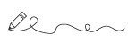
Penmanship might be falling out of fashion with our addiction to font and screen but calligraphy, the art of producing decorative handwriting, is booming. From the Greek words kalli and graphia, meaning beautiful handwriting, calligraphy uses writing implements of various widths – usually pens and brushes – to create flamboyant flourishes on letters. Just like music is made up of notes and the universe is made up of atoms, calligraphy is made up of a few basic strokes. It looks complicated and as with all visual arts practice makes perfect.
The basic tools you’ll need to get to start calligraphy are pen and paper. Depending on the pen you use, or if you use brushes, you’ll need to add ink to your list. Then, once you graduate from practicing on lined notebooks, you’ll need page to create the height lines for your lettering. And of course, you’ll need a good sized desk or table to work on. Make sure you lay everything out neatly on your desk, with inks well away from paper, because the last thing you want to do is ruin your work with a spillage.
A thin-lined notepad with good quality paper is the best place to practice, but you still need height lines marked out. The size of your letters is in direct proportion to the pen you are using. Choose your base line on the page – not the top line but not the middle one either, otherwise you’ll waste paper. Use the pen nib to draw a dot (it’ll look like a small square) on the base line. Then draw another and another, each stepped up from the last. This is known as a nib ladder, and five steps on your nib ladder gives your “waist line”, which is the height of your lowercase letters. Ascenders (d, b, t, etc.) step up a further four nib squares from the waist line. Descenders (g, q, y, etc.) step down four nib squares from the base line.
Now it’s time to practice. Your pen nib will like to travel down the page in a pull, rather than be pushed up it. Some pens will work on “backwards” push strokes, but western text is all pull, not push strokes. The key is to get your basic letter legible then have fun improvising your flourishes. While most beginners do practice individual letters at first, you’ll find greater improvement if you practice using whole words. Another good beginners’ tip is to only use lowercase letters – you use lowercase far more often than capitals anyway. Once you have the alphabet down, you can start adding capitals to your words.
You need to add another line to your page to show the height line for capital letters – mid-way between the waist line and the ascender line. As with lowercase letters, begin by doing the basic strokes necessary for the letter and don’t add any flourishes until you have completed your word. The tail of a capital E or H for example can be extended to underscore the word. You can really go to town improvising with capital letters, have a look at some old illuminated texts for inspiration.
Keep practising this handy skill and you’ll be scripting wedding invitations, letters of congratulation and beautiful cards before you know it.


